Although the most visible role I have with DGA is to crisscross the country playing as many unique disc golf courses as I can (1,741 courses played and counting), my primary role with DGA for the past 8-9 years has been creating most of the graphics for the tee sign products that they offer to courses around the planet. And as the person they’ve essentially entrusted with developing the look and style of those sign products? I have made sure to stick to vector graphics that have a high contrast in color. Avoiding gradient fills in grasses, water, asphalt surfaces, etc. whenever possible.
One of the reasons I have done this is the old adage of “K.I.S.S.” Keep It Simple, Stupid! 🙂 Signs can be pretty/attractive! But signs are not meant to be “works of art,” as much as they are meant to quickly and clearly convey the information that sign users need in order to have a more positive experience on a course. End-user design (designing with the end user in mind). That said? One of the other reasons why I have always stuck to vector work and clean, non-gradient fills is accessibility.
Many people do not realize it, but approximately 1 in 12 men (8%) and 1 in 200 women (0.5%) are colorblind. People who have trouble distinguishing reds and greens. Blues and yellows. It is something talked about in marketing and design circles, as if prospective purchasers and users of products cannot make out the details required to interpret information and use said products effectively? It can make life harder for customers and end-users of said products. But as it relates to the disc golf industry (and tee signage, in particular), I too-often come across design work that turns to mud when put to the test using colorblindness simulators such as Coblis.
I won’t pick on any other designers or companies who aren’t taking care with their contrast or object fills! That said, I thought it might be interesting for people to see how colors look different based upon the various forms of colorblindness that people experience.

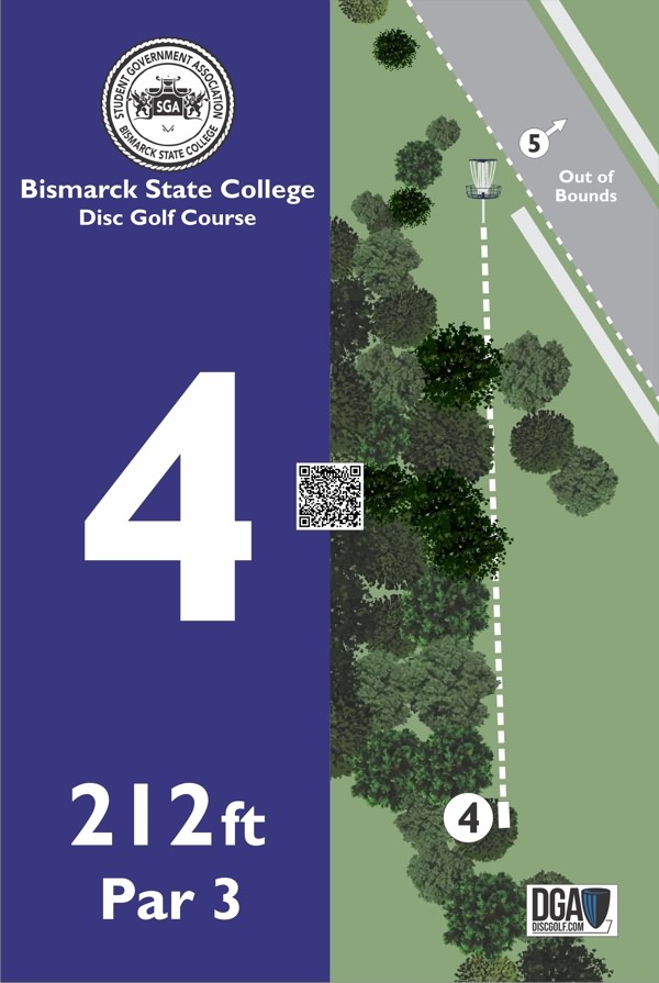
Above is an example of a recent tee sign project as it appears to a majority of the population. The color of the basket top and catcher are too close in lightness/darkness to the darker trees on the signs, but having the white chains, a white pole, and a dashed white line (indicating the fairway) helps overcome this issue. But now take a look at that same sign while simulating various forms of colorblindness:


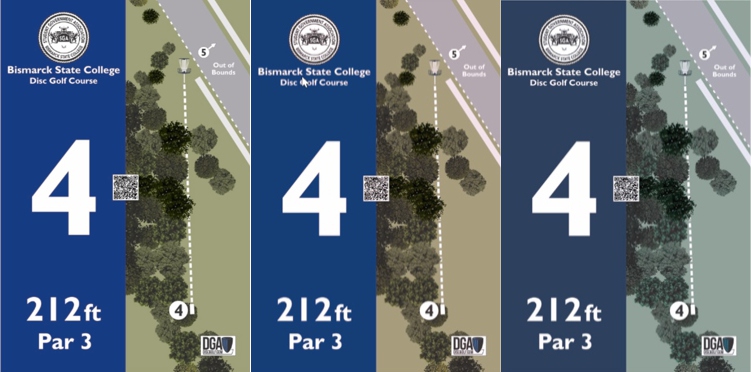
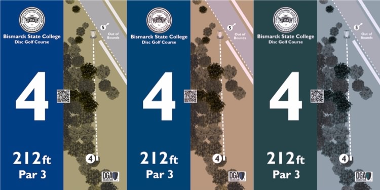
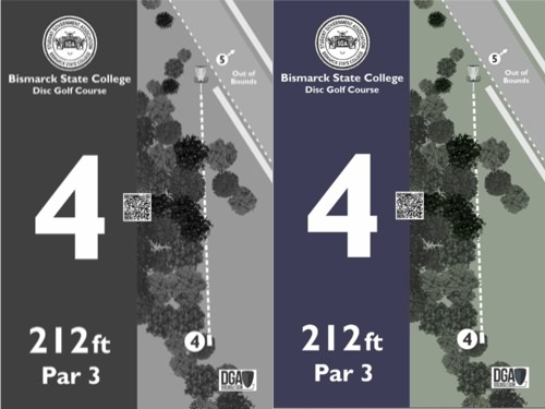
As you will see, that same sign can look dramatically different, depending upon the form of colorblindness individuals might have. For example, people with achromatopsia will barely be able to distinguish between the green grass and gray street above and to the right of the basket! That is where the dashed white line, different from the dashed white line indicating the hole fairway and the white “Out of Bounds” text, is critical in helping those individuals tell the difference in surfaces.
I certainly don’t NEARLY bat 1.000 in my efforts to design signs that create zero problems for individuals with colorblindness! But I try my best, juggling making signs attractive and functional for everyone while accommodating client requests for specific colors to be used on their signs. And if this post conveys anything to the people reading it? Know that:
1. Designing tee signage (and choosing disc colors, for that matter) is more than people simply choosing colors and textures they think “are pretty.” Many professional designers will have spent months (probably years) learning about these types of issues.
2. Good course owners/operators are thinking about these types of things as well. Designing resources such as signage that make it easier for their guests to experience said designs.
3. DGA is thinking about these types of issues as they produce a bevy of different designs/graphics to improve our sport of disc golf.
Okay, I’ll take my graphic design nerd hat off for a while. I just had it on my heart to share this today with readers. A bit of a look behind Oz’s curtain in how we do what we do (and why). I’ll get back out on the course collecting trail again soon! 🙂
Magic Number = 259 (1,741 Courses Played)
How it All Got Started: Tonn’s Travels >>
A main purpose of this blog will be to share information, helpful tips and tricks (everything from health and fitness to methods for saving money while you’re out “bagging courses” of your own), and ideas for better, safer course design. But I am also hoping to inspire others with my passion for the sport, via the stories I can share about all of the interesting experiences I have. All of the interesting people I meet. All of the amazing courses I am blessed to have the opportunity to play. If I can inspire even a handful of individuals to get off the couch, get “out of their bubble” or “security blanket” and explore more of this big, beautiful planet we all call home? Then I will consider this effort a success.
About Derek
Derek Tonn is a member of the DGA’s Ambassador Team. His company, Mapformation, LLC, has been DGA’s partner in the development of disc golf tee signage since 2012. The longer our two companies have worked together, and the more Derek has gotten to know all the great folks at DGA, the more he has wanted to formally sing the company’s praises. The more he has realized that “Steady” Ed the father of disc golf and the modern-day Frisbee vision for the sport and his company perfectly describes his own interests and priorities related to disc golf, and the more Derek has recently been encouraged to share his story.

